
· By Michael Rosenzweig
Design Updates
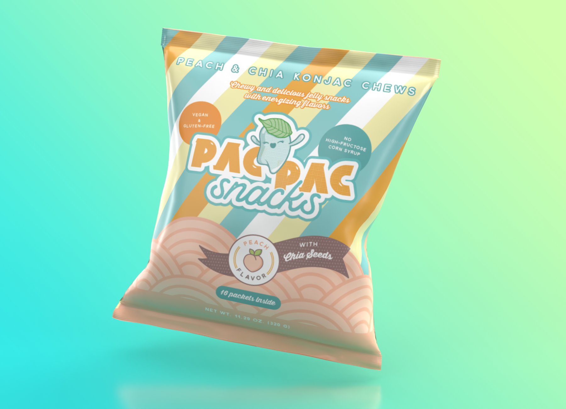
We spent the summer working with designer Judith Cotelle on a brand logo and package design for our initial jelly snack products.
The logo we decided on is bulky, playful and energetic, and the glints and volume in the logo are meant to mimic the texture of our jellies. In addition, Judith designed for us a kawaii jelly character that is joyful, energetic and chewy! All of these elements are meant to reinforce the elated feeling we hope customers will have when they enjoy our snacks.
For the packaging, we wanted the customer's first impression to be vibrant and clean, reflective of the fact that the jelly chews are a wholesome, Japanese-inspired snack. In addition, we wanted the design to bring a modern overall impression to retro, Japan-inspired designs that Shinji and I grew up appreciating.
